Remember when ski season *completely* shut down in mid-March of 2020 with the onset of the Covid-19 pandemic? How could we forget such a painful day!?
I work in the ski industry so with the sudden shuttering of resorts across the world, my job came to a screeching halt and I didn't have much work to do. I decided to try watercolor painting to ease the angst and found incredible satisfaction in learning this whimsical and wild hobby. This article will roll through some basics and provide a tutorial for painting a simple mountain sunset scene with watercolors using the wet-on-wet technique.
Being a beginning watercolor painter is a scary thing, so I hope this inspires you to throw caution to the wind and give it a go!
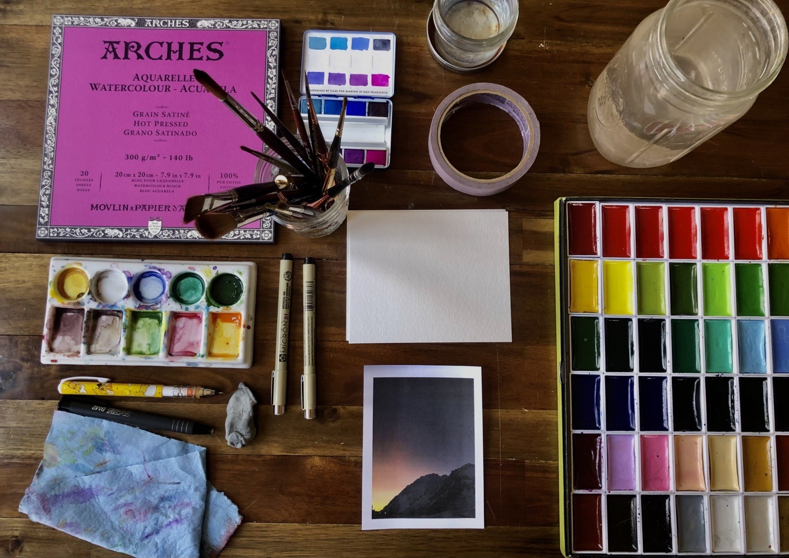
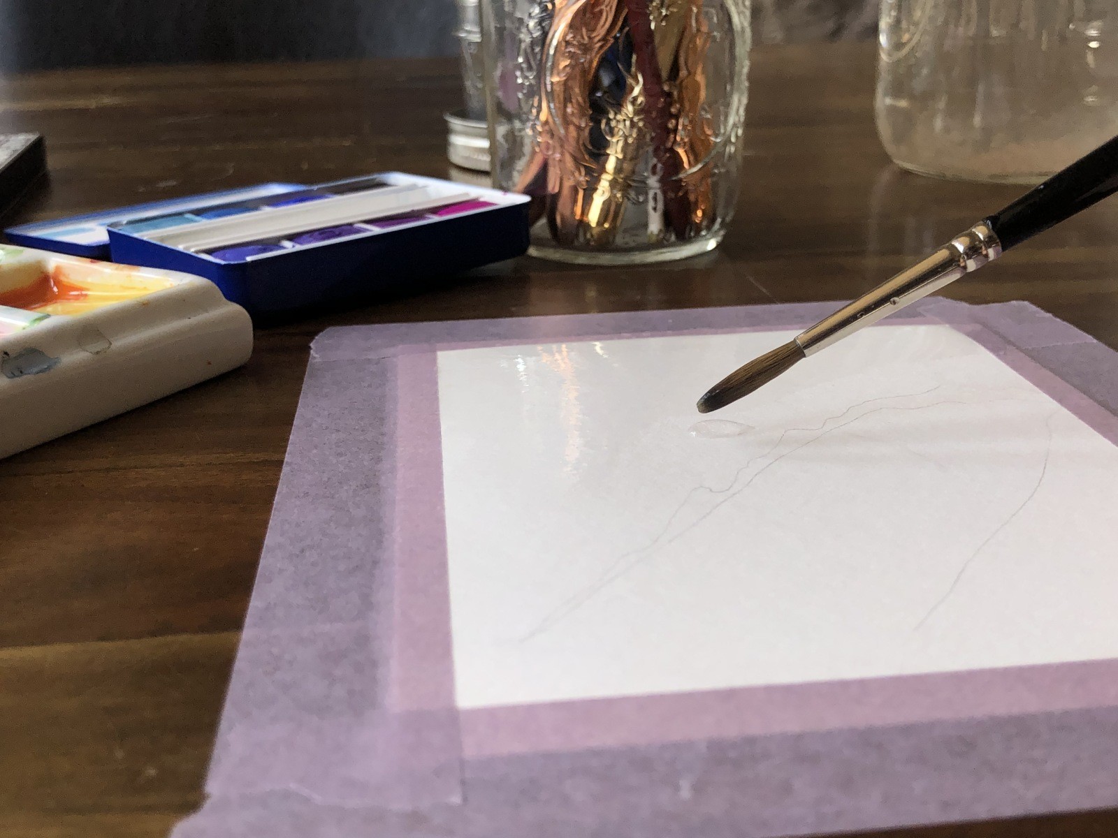
MATERIALS
Before you can get started with your mountain watercolor, you'll need to gather a few crucial supplies. I've left a basic list below, but there is a far more comprehensive blog post on my website with recommendations about specific materials and the essentials a beginning watercolorist will want to have—click here.
Tip: The most important piece of gear is definitely your watercolor paper! Don't skimp on paper! You'll need good quality watercolor paper to achieve positive results. The thicker or heavier the weight of the paper, the more absorbent the paper, which allows you to add more water and pigment and really enjoy the tactile experience of watercoloring. Be sure to get paper labeled as watercolor paper and don't bother attempting with thin paper or anything like computer paper. That would be like showing up to go skiing in flip flops!
- Two jars of clean water
- Paintbrush (watercolor brushes are preferred, but when just starting out, a decent brush will suffice)
- Good quality watercolor paper
- Watercolor paints (make sure you have watercolor paints—ditto!)
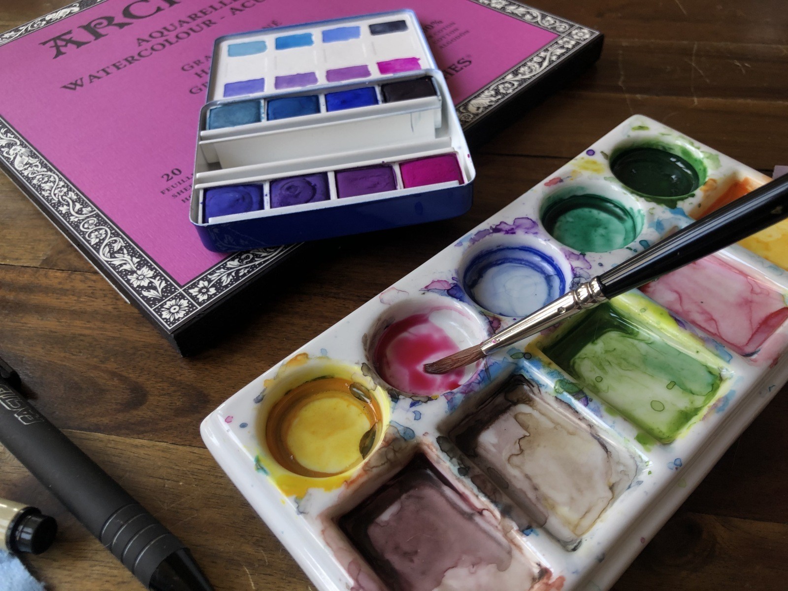
- Palette (a plastic lid is fine for our purposes)
- Tissue or paper towel
- Pencil and eraser
- Reference photo of the mountain you'd like to paint (I chose a scene from Alta Ski Area)
- Clipboard and masking tape or painter's tape
GETTING STARTED
Lay out all your gear in an orderly manner with enough workspace to move around. I also recommend a spot near a big window with natural light. If you have a nice table you'd like to avoid damaging, lay down some thick cardboard atop a towel or rag for protection. Before you begin, you'll want to wash your hands. If your hands are dirty or oily it could ruin your paper or your painting, so it's always prudent to wash your hands first.
MINDSET
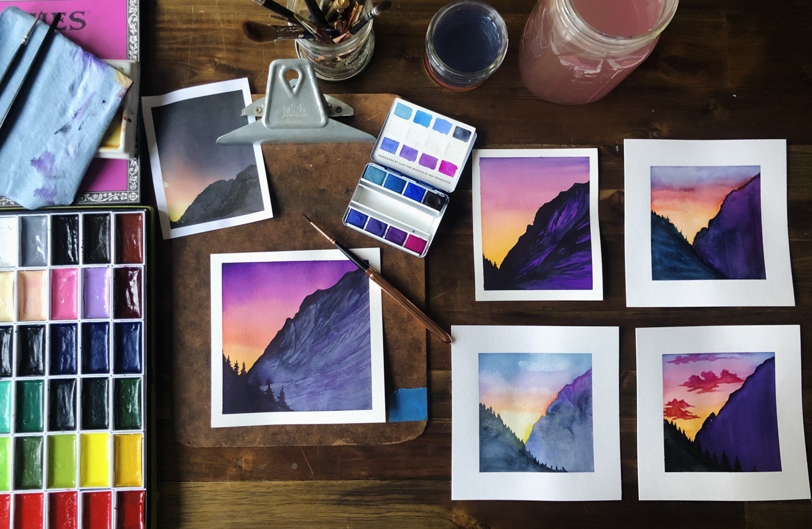
Turn on some music that makes you happy. This will help you loosen up and find your flow. Before I begin, I like to close my eyes and take 6-10 deep breaths. I visualize my happiest powder day memory and this puts me in a positive and excited state to begin my painting. With watercolor, it's important to approach your work with loose and open expectations. It's difficult to 'control' the outcome of watercolor paintings, so approach it with a child-like wonder and be totally open to the outcome. As you can see from below, I've painted the same scene five times and all five paintings are COMPLETELY different!
PREPARATION
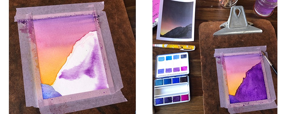
Grab your paper and cut down to size. I do find that starting with a smaller size is far less intimidating, so I recommend something 6x6 inches or smaller. If you don't have a clipboard lying around, a thick and stiff expanse of cardboard or an actual board will do. It will be much easier to control your paint if you secure the edges or work from a watercolor block (more info about that in my blog post).
STEP 1: GET STUCK
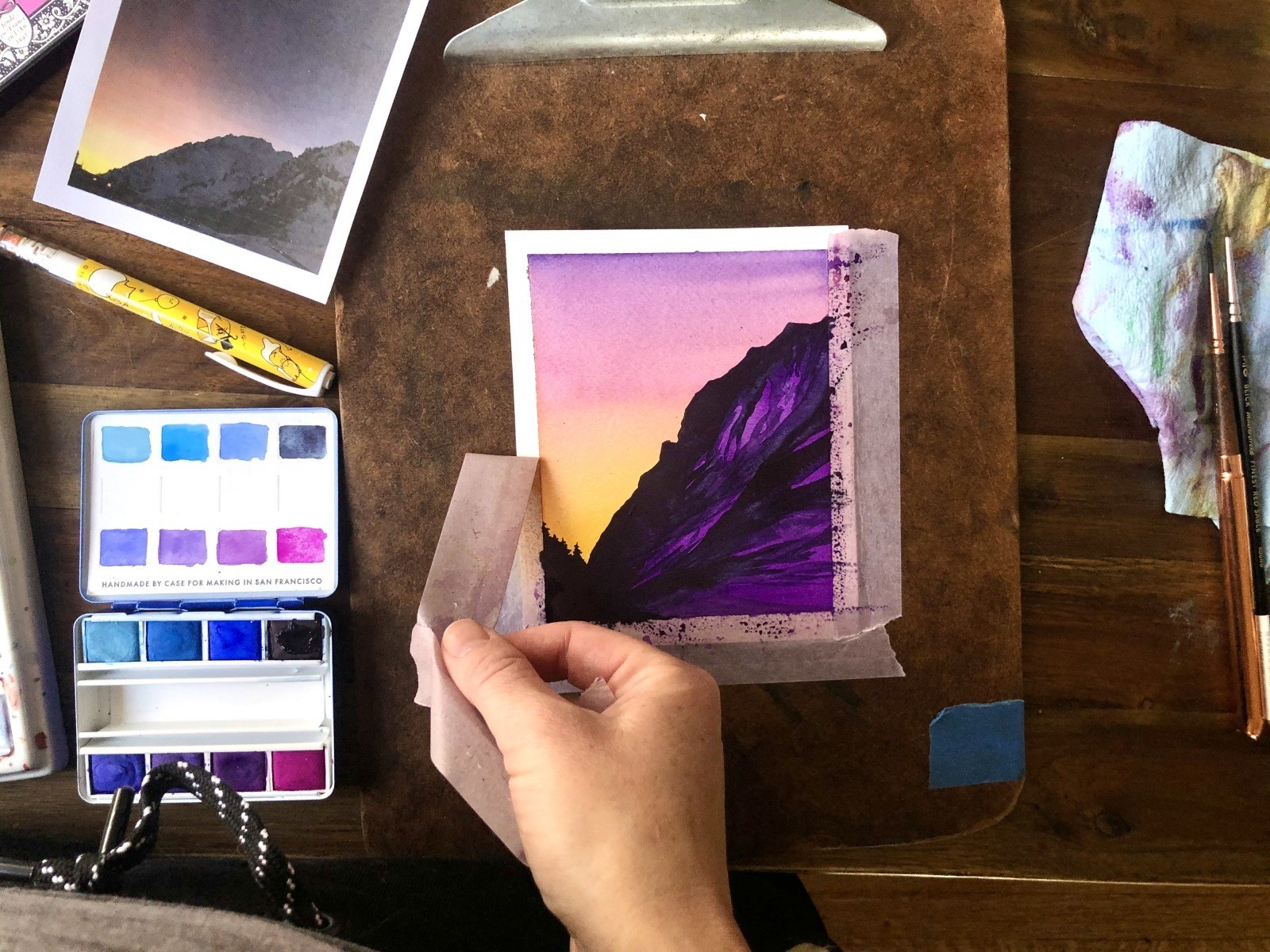
We're going to be tilting our clipboard up and down to move pigment along the paper's wet surface. We also don't want the watercolor paper to curl as we add water. To achieve this, you'll need to apply a thin border of masking tape or painter's tape along each edge of the paper, adhering it tightly to the surface of the clipboard. Make sure to press the tape firmly and run your finger or a ruler over the tape's edge several times. Not only will this secure the paper on your clipboard, but it'll create a sharp border once the tape is removed.
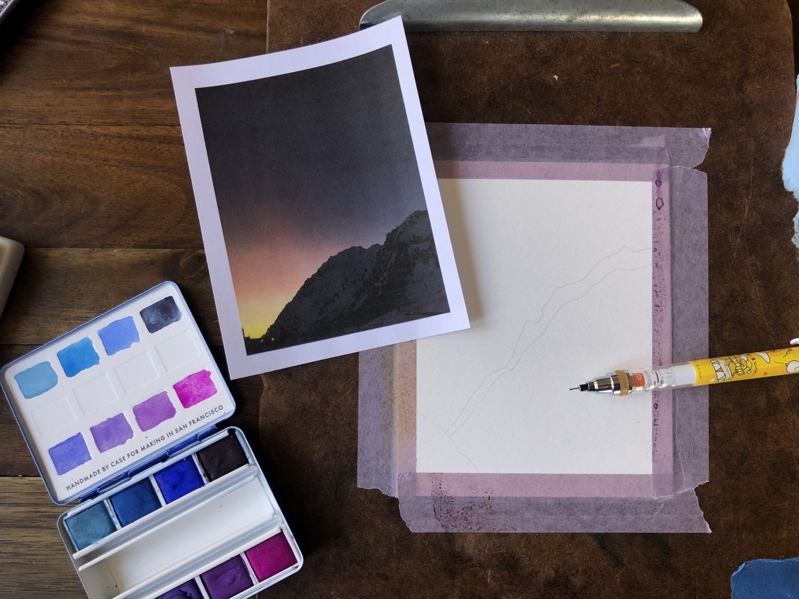
STEP 2: GET SKETCHY
Pull out your reference photo and loosely sketch the outline of your mountain. Don't agonize over this, just focus on creating the approximate shape by evaluating the positive and negative space. We'll come back later with darker paint to better define the outline, so as long as you nail the basic shape, that is sufficient. You can see my two quick and loose attempts above—I'm not sweating the details.
STEP 3: COLOR ACTIVATION
To begin our journey, we need to activate our watercolors. If you'd like to experiment with mixing, go ahead and select the colors you like and mix them together on a palette. For simplicity's sake, I'm using colors directly out of the watercolor pans and mixing the pigment on the paper using the wet-on-wet technique. (This means we'll first be wetting the paper with clean water and then adding water to our brushes to scoop up pigment and swipe it across the paper).
Add a little bit of clean water to the brush and gently wipe it across the surface of the watercolor you want to activate. When cleaning your brush, first dip it in your largest water jar (jar 1) and swirl it around vigorously. Be careful not to swipe the bottom or leave your brush standing in the water as this will damage the bristles. After a few swirls, dip the brush in the second jar (jar 2) of clean water and activate your next color. For this painting, I am starting with a deep red, a bright orange, a warm yellow, a deep fuchsia and a purple for my sunset.
STEP 4: WET YOUR PAPER
Next, we'll wet our watercolor paper. The pigment will only go where you've got water laid down using the wet-on-wet technique. Wet the entire sky from jar 2 water, taking care to carefully trace the outline of your mountain. It need not be totally exact but using a smaller brush to trace this outline may be helpful. Be sure NOT to apply water inside the mountain's silhouette. If you're unsure about coverage, try peeping at your paper with your eyes level to the table. You should be able to see the water reflecting off the paper and can then apply any extra water to areas of the sky that are still dry.
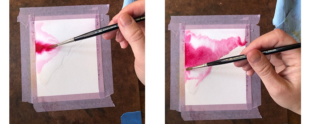
STEP 5: COLOR DROP
Now, the moment we've been waiting for! I highly suggest you first watch the YouTube time-lapse linked above!
Dip your brush in the clean water of jar 2 and pick up some pigment from your red or pink hues. Apply about three-quarters of the way up into your sky. You'll see the color rapidly bloom across the page—this is good! This is the 'flow' we're trying to encourage. Clean the brush in jar 1, then transfer your brush to jar 2 to pick up more liquid. Grab some orange pigment and streak it across the page below the pink/red. Remember to keep loose! Nothing on the paper is final until the paper is dry. Your one concern is to keep the purple and orange (complementary colors) apart. If they should mix a brownish color will be the result.
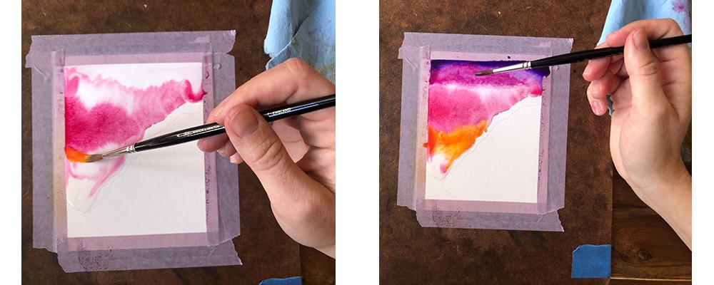
If you end up with puddles of water, gently tilt your clipboard so it accumulates in a corner, taking care to avoid mixing purple and orange. Once you've corralled your excess water, dab with an absorbent towel. Keep moving the pigment over the paper. It will continue to mix and mingle until it dries. You must work quickly during this phase. Don't overthink it and just GO WITH THE FLOW!
You want the colors to blend, creating a smooth gradient. If you're seeing distinct lines, try adding a little more pigment or water. Experiment! Learning how to paint gradients is one of the best ways to begin understanding the magic of watercolor. If you mess up—AWESOME—you just learned something valuable and became a better artist. Reflect on that while you whip out another piece of paper and give it another go.
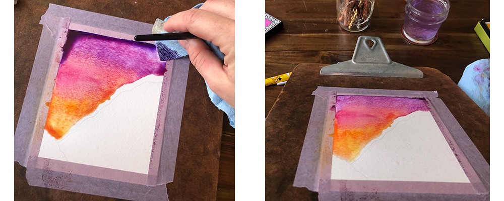
STEP 6: DRY IT OUT
When you've achieved the gradient effect you like, it's time to let your masterpiece dry. Remember, watercolors will typically appear lighter when they are dry. You can alter the opacity of your paints by playing with different ratios of water and pigment. Personally, I think lots of pigment works best for sunsets, but you should play around and see what looks best to you. Wait 10-15 minutes for your sunset to dry out. Our next stop is to paint the base coat of our mighty mountain. In this case, Alta's iconic Mount Superior.
STEP 7: MAKING MOUNTAINS
Pick a darker pigment for your mountain silhouette. I went with some deep blues and purples. Before beginning this second phase, be sure that your sunset sky is completely dry! Once you're certain, wet your paper again with jar 2 water like we did for the sunset, only wetting the area of the mountain. Add your chosen pigments, swirling and mixing them to add a bit of depth. You can be loose and quick with this step, it's just our base coat and we're going to add more layers. Once you have nice coverage, set aside to dry for another 10-15 minutes.
STEP 8: IT'S ALL IN THE DETAILS
Once your mountain is dry or mostly dry, it's time to add some definition and shadows. Pick a darker pigment for this part. This is another time when it's best not to 'think' about what you're doing. You are a mountain person. You love mountains. You know what mountains should look like. Don't fret about accurately capturing every nuance of the geology, follow your intuition and simply add organic shapes. Think about ridge lines that trend downward in predictable ways.
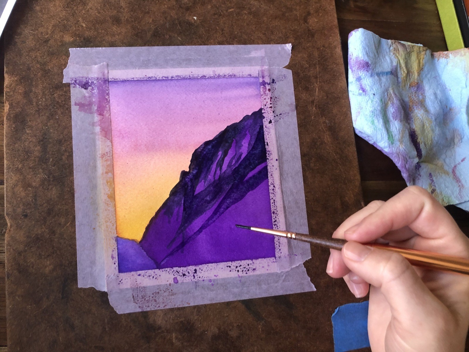
If you have a fine-tipped brush, you can add a few happy little trees, if it pleases you. I recommend painting a thin straight line representing the trunk of your tree, then swishing the brush back and forth in erratic, organic gestures to approximate branches. Watch the video above for more insight on how to complete this step.
If you're feeling uncertain, step back and allow your painting to dry for a bit. Trust your gut and intuition to know if you need to add more detail or leave your painting be. I've found that the best results arise when I'm simply channeling my joy for the mountains and ignoring any doubts or fear that arise.
After all, if you can hurtle yourself down a slope of frozen water on wooden sticks with metal edges, I know you can drag this brush loaded with a little pigment around! Skiers and snowboarders are simply brave people by nature. This is just a different way to channel your courage. You've got this...
RELATED ARTICLES
Lamont Joseph White: Skiing in Color: Click Here
The Best Books About Skiing & Snowboarding: Click Here
Powder People | The Meinholds: Click Here
The History of the "Greatest Snow on Earth": Click Here